
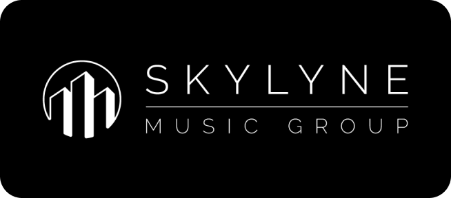
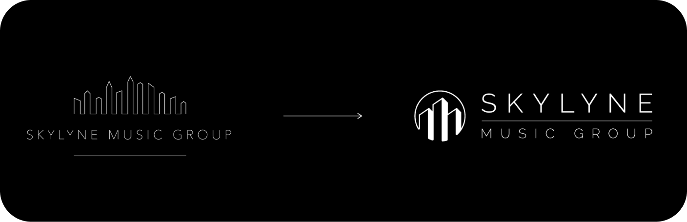
Skylyne Music Group.
Rebranding an artist first management company serving as a platform for full service music development ranging from music production to marketing plans.
role type.
Lead Designer
timeline.
6 Weeks
project context.
The goal of Skylyne is to place artists at the forefront of their company.
Understanding their "Artist First" mentality drove my ideation to maintain an unobtrusive and behind the scenes brand for the company which would allow for artistic freedom, while still highlighting Skylyne and the services that they offer
applied skills.
Logo Design • Typograpjy
key contributions.
Icon Ideation: Redesign the brand mark to improve scalability and usage across multi-media
Typography: Redesign the type to match an updated modern and unobtrusive aesthetic

brand visuals.
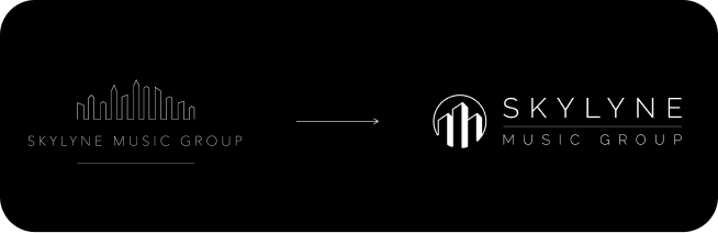
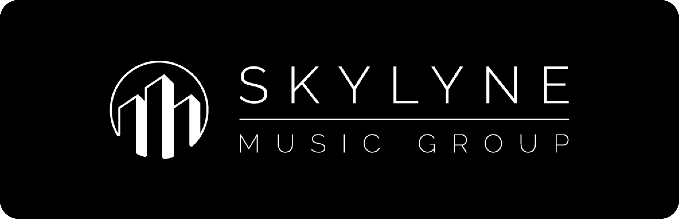
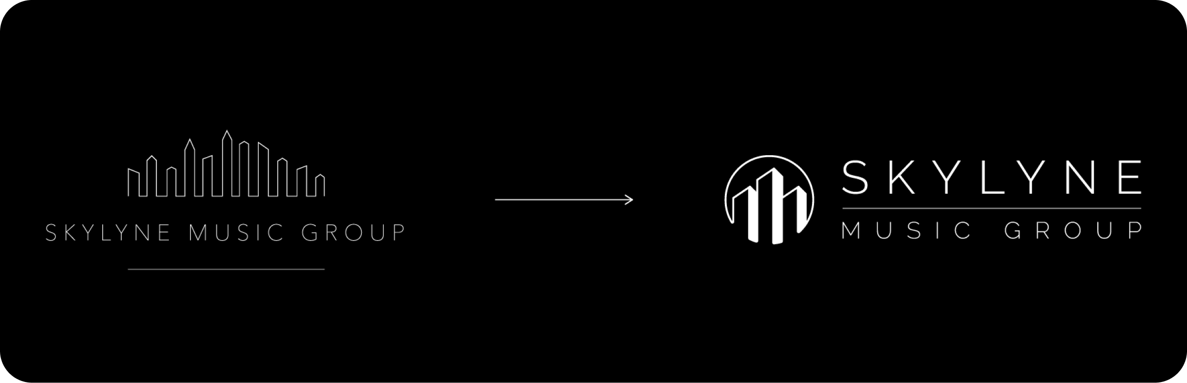
Designing an icon that scales

I focused heavily on trying to retain the essence of the old brand, while also allowing for more diversity in use. Replacing the skyline in the logo with a simplified icon allowed for more diversity and easier brand recognition on both print and digital mediums
Replacing the skyline in the logo with a simplified icon allowed for more diversity and easier brand recognition on both print and digital mediums
Distilling the skyline down to 3 buildings significantly reduced the space needed. It gives the logo more opportunity for independence, and can now serve as a point of interaction to the greater Skylyne brand on social media and other digital mediums.
Adding color for pop
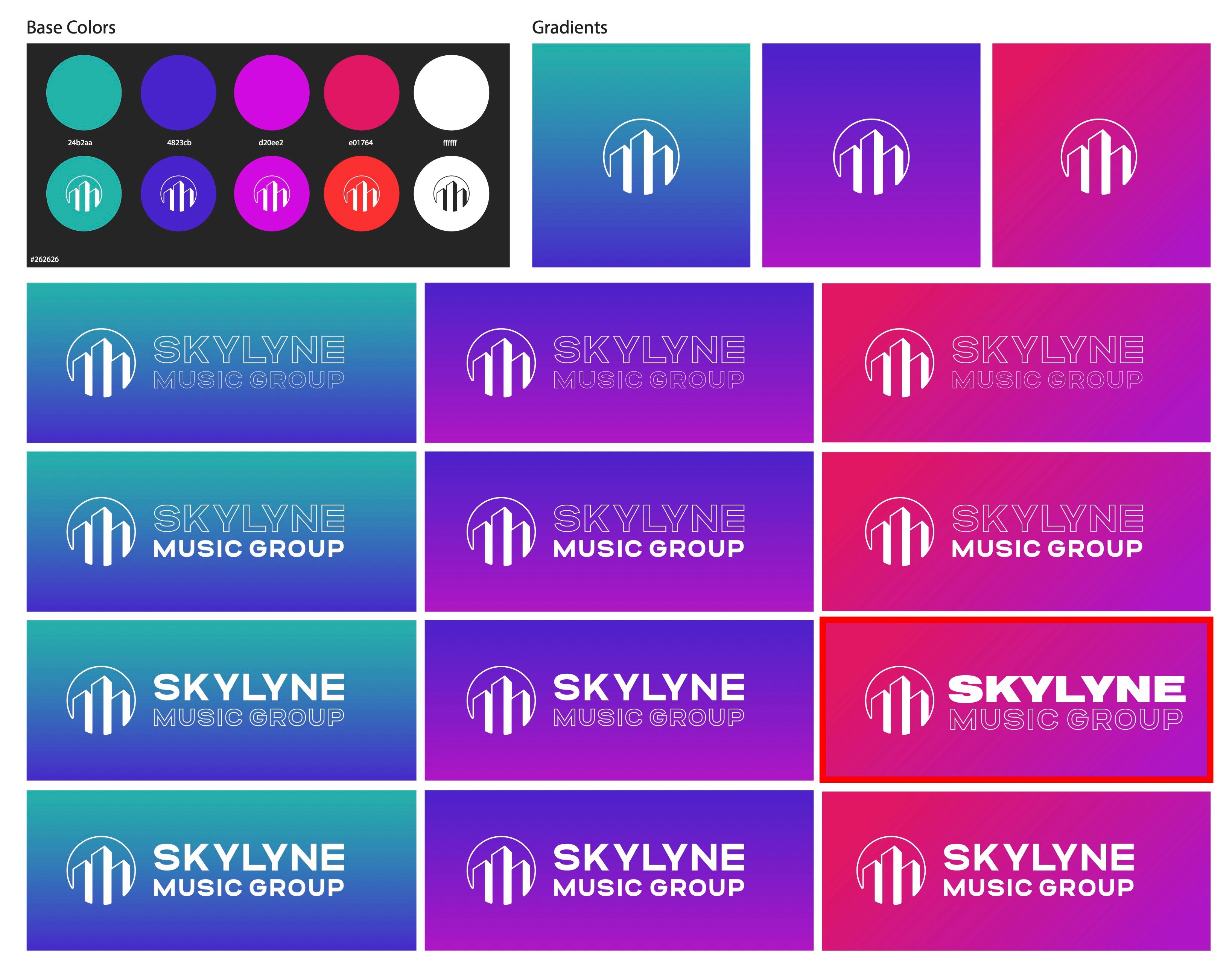
While the brand is minimal, color can be used to highlight the brand, there was a need for visual flare when used in marketing and promotional material.
Along with the logo, I designed gradient backgrounds that could be used as backdrops for the brand to bring more awareness and stand out among competing materials
2026 PAVAN R.


Skylyne Music Group.
Rebranding an artist first management company serving as a platform for full service music development ranging from music production to marketing plans.
role type.
Lead Designer
timeline.
6 Weeks

project context.
The goal of Skylyne is to place artists at the forefront of their company.
Understanding their "Artist First" mentality drove my ideation to maintain an unobtrusive and behind the scenes brand for the company which would allow for artistic freedom, while still highlighting Skylyne and the services that they offer
applied skills.
Logo Design • Typograpjy
key contributions.
- Icon Ideation: Redesign the brand mark to improve scalability and usage across multi-media
- Typography: Redesign the type to match an updated modern and unobtrusive aesthetic

brand visuals.
Designing an icon that scales
I focused heavily on trying to retain the essence of the old brand, while also allowing for more diversity in use. Replacing the skyline in the logo with a simplified icon allowed for more diversity and easier brand recognition on both print and digital mediums
Replacing the skyline in the logo with a simplified icon allowed for more diversity and easier brand recognition on both print and digital mediums
Distilling the skyline down to 3 buildings significantly reduced the space needed. It gives the logo more opportunity for independence, and can now serve as a point of interaction to the greater Skylyne brand on social media and other digital mediums.
Adding color for pop
While the brand is minimal, color can be used to highlight the brand, there was a need for visual flare when used in marketing and promotional material.
Along with the logo, I designed gradient backgrounds that could be used as backdrops for the brand to bring more awareness and stand out among competing materials
Skylyne Music Group.
Rebranding an artist first management company serving as a platform for full service music development ranging from music production to marketing plans.
role type.
Lead Designer
timeline.
6 Weeks
project context.
The goal of Skylyne is to place artists at the forefront of their company.
Understanding their "Artist First" mentality drove my ideation to maintain an unobtrusive and behind the scenes brand for the company which would allow for artistic freedom, while still highlighting Skylyne and the services that they offer
applied skills.
Logo Design • Typograpjy
key contributions.
- Icon Ideation: Redesign the brand mark to improve scalability and usage across multi-media
- Typography: Redesign the type to match an updated modern and unobtrusive aesthetic

brand visuals.
Designing an icon that scales
I focused heavily on trying to retain the essence of the old brand, while also allowing for more diversity in use.
Replacing the skyline in the logo with a simplified icon allowed for more diversity and easier brand recognition on both print and digital mediums
Distilling the skyline down to 3 buildings significantly reduced the space needed. It gives the logo more opportunity for independence, and can now serve as a point of interaction to the greater Skylyne brand on social media and other digital mediums.
Adding color for pop
While the brand is minimal, color can be used to highlight the brand, there was a need for visual flare when used in marketing and promotional material.
Along with the logo, I designed gradient backgrounds that could be used as backdrops for the brand to bring more awareness and stand out among competing materials